Data visualization serves a pivotal purpose and potently motivates analyses, communicates data-driven findings, and finds errors. Data visualization is utilized to represent both large-scale and small-scale data.
All of this and more can be learned by enrolling in data visualization courses available online. There is an array of data visualization online courses on the internet. Hence, finding one from the rest can be pretty daunting.
Well, fret no more! We did streamlined research and have accumulated a list of the 15 best data visualization courses online. Let us get started and read about them in detail.
15 Top Data Visualization Online Courses
- Data Visualization by Illinois – [Coursera]
- Data Visualization with Tableau Specialization by the University of California – [Coursera]
- Data Science: Visualization by Harvard University – [edX]
- Data Analysis and Presentation Skills: the PwC Approach Specialization by PWC – [Coursera]
- Learning Python for Data Analysis and Visualization – [Udemy]
- Data Visualization with Python by IBM – [Coursera]
- Data Analysis and Visualization Foundations Specialization by IBM – [Coursera]
- Microsoft Excel – Data Visualization, Excel Charts & Graphs – [Udemy]
- Mastering data visualization in D3.js – [Udemy]
- Professional Certificate in Fundamentals of Data Visualization with Power BI by Davidson – [edX]
- Data Visualization – [Udacity]
- Learn Data Visualization with Python – [CodeCademy]
- Big Data: Data Visualisation – [FutureLearn]
- How to Process, Analyze and Visualize Data – [MIT Open Courseware]
- Data Visualization – [Pluralsight]
15 Best Data Visualization Courses Online With Certifications
1. Data Visualization – Offered by Illinois [Coursera]
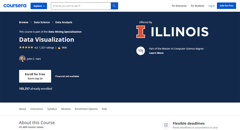
Need the best data visualization certification course? If yes, this Coursera course can be your go-to pick.
| Institute | The University of Illinois at Urbana-Champaign |
| Instructor | John C. Hart |
| Duration | 15 hours |
| Certificate | Yes |
| Self-paced | Yes |
| Rating | 4.5 |
| Enrolled | 105,257 |
| Return or Refund | 7-days trial, after which you will have to pay. You can receive your refund within 14 days of the payment. |
| Cons | It lacks adequate practice questions for students to be thorough with the subject. |
Learning Outcome
By undertaking this data visualization certificate specialization, you will understand the following:
- General data mining concepts via basic applications and methodologies
- Pattern Discovery & its application
- Methods for pattern-based classification
- Content and skills to engage and practice in scalable pattern discovery methods on massive transactional data
- Study methods for mining different types of sequential patterns, patterns, and sub-graph patterns.
Prerequisites
This is the best data visualization certification course for beginners. It is the Course 1 of 6 in the
Data Mining Specialization. So, no prior knowledge is needed. However, if you want to build on the knowledge, you can take the other five courses in the data visualization training.
Review GC:
Very useful course. It enlightens my ways to data visualization. I knew some concepts, but in a disorganized way and not knowing how. This course fills these gaps. It is tremendously helpful.
2. Data Visualization with Tableau Specialization – Offered by University of California [Coursera]
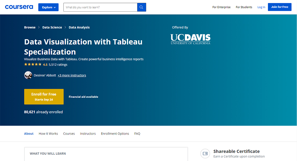
Ranked second on our list for the top data visualization online courses is again a course available on Coursera.
| Institute | University of California |
| Instructor | Desiree’ Abbott, Hunter Whitney, Govind Acharya, and Suk S. Brar |
| Duration | 6 months (3 hours every week) |
| Certificate | Yes |
| Self-paced | Yes |
| Rating | 4.5 |
| Enrolled | 80225 |
| Return or Refund | 7-days trial, after which you will have to pay. You can receive your refund within 14 days of the payment. |
| Cons | The assignments are peer-reviewed. It is more of a basic course in visualization rather than tableau alone. |
Learning Outcome
Some things that you will learn with this data visualization certificate course are:
- Navigating, examining, and learning to use the different Tableau features.
- Assessing the quality of the data
- Combining data to and following the best practices for presenting the story.
- Performing exploratory analysis
- Creating and designing the data visualizations and dashboards to serve the requisite audience.
Prerequisites
This is one of the top data visualization online courses and is meant for beginners with no experience in Tableau.
3. Data Science: Visualization – Offered by Harvard University – [edX]
![Data Science: Visualization – Offered by Harvard University – [edX]](https://www.tangolearn.com/wp-content/uploads/2021/09/data-science-visualisation-by-harvard-university-1.jpg)
This data visualization training course is a part of the Professional Certificate Program in Data Science.
| Institute | Harvard University |
| Instructor | Rafael Irizarry |
| Duration | 8 week (1-2 hours per week) |
| Certificate | Yes |
| Self-paced | Optional |
| Paid/Free | Optional |
| Enrolled | 213,816 |
| Return or Refund | Within 14 days of the payment. |
| Cons | No certificate is included in the free version. |
Learning Outcome
It is one of the best data visualization courses online and has a couple of things for you to learn. Some of them include:
- Understanding of the data visualization principles
- Communicating data-driven findings
- Using ggplot2 for creating custom plots
- Understanding the shortcomings of different plots and ways to avoid them
Prerequisites
This is a beginner-level training course.Hence, to take the course, you need no prior experience. However, it would help if you had the latest version of the browser that supports programming directly in a browser-based interface.
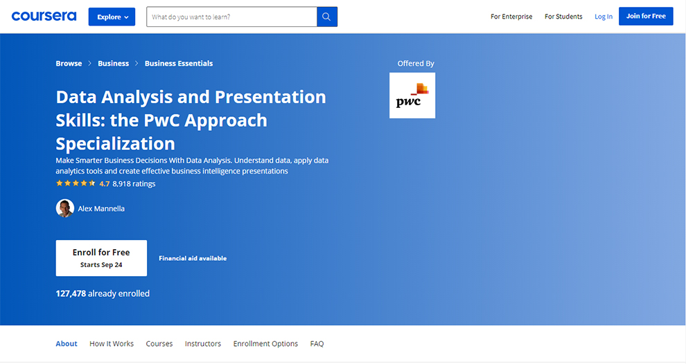
4. Data Analysis and Presentation Skills: the PwC Approach Specialization – Offered by PWC [Coursera]
An impeccable benefit of enrolling in these data visualization online courses is that you can join the PwC’s talent network after you are through with the courses. This will give you access to PwC career opportunities, happenings in the PwC global network, and thought leadership. This data visualization certificate program is free for PwC’s employees.
| Institute | PWC |
| Instructor | Alex Mannella |
| Duration | 6 months (3 hours every week) |
| Certificate | Yes |
| Self-paced | Yes |
| Rating | 4.7 |
| Enrolled | 127,276 |
| Return or Refund | 7-days trial, after which you will have to pay. You can receive your refund within 14 days of the payment. |
| Cons | Many places in the course seem like a branding strategy for PWC, which is unfair for the students undertaking this data visualization training. |
Learning Outcome
A few things that you will learn with this data visualization certificate program are:
- Understanding the practical use cause of data analysis
- Using business intelligence in real-world outcomes
- Explore how an amalgam of filtering, better understanding, and data application can help in problem-solving, triggering better decision making.
- Know the proper techniques to use Microsoft Excel, PowerPoint, and other typical data analysis and communication tools.
- Present the data in a more engaging manner
Prerequisites
This is the best data visualization certification course for beginners with no prerequisites.
5. Learning Python for Data Analysis and Visualization – [Udemy]
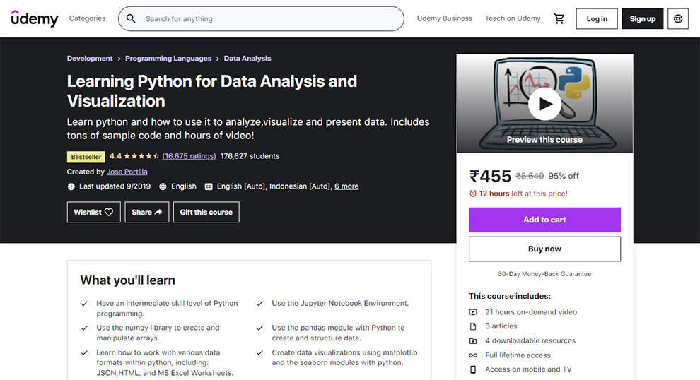
This is one of the top data visualization online courses,and it comprises more than 100 practical examples of python code notebooks.
In addition, you can find both the new and latest video classes on it with lifetime access. So, whatever new additions are made, you will have access to them too.
| Instructor | Jose Portilla |
| Duration | 21 hours on-demand video |
| Certificate | Yes |
| Self-paced | Yes |
| Rating | 4.4 |
| Enrolled | 176,510 |
| Return or Refund | 30-days moneyback guarantee |
| Cons | Parts of this data visualization training module are obsolete and not relevant now. |
Learning Outcome
Some things you can expect to learn with this data visualization certificate program are:
- Utilizing the NumPy library for manipulating and creating arrays
- Employing Jupyter Notebook Environment
- Using the pandas module with Python for data creation and structure
- Learning to work with the different data formats within Python, such as JSON, HTML, and MS Excel Worksheets.
- Building a portfolio of various data analysis projects
- Creating data visualizations with matplotlib and the seaborn modules with Python
Prerequisites
This is the best data visualization certification, and there are some prerequisites associated with this. To take this course, you must possess:
- Basic math skill
- A willingness to learn and grow
- A Mac, Windows, or Linux laptop
- Basic or intermediate Python skills
Are these the best data visualization courses online for you?
This data visualization certificate program is ideal for:
- Students who wish to learn about the burgeoning data science world
- Students who want to learn data visualizations, data science, or Python
We also have special recommendations for the best data science classes and python courses here.
Review Scott Ferguson:
Excellent introduction to the topics. There are very minor attribute errors for updated modules, but that gives the student an excellent opportunity to search for solutions on StackOverflow or other websites.
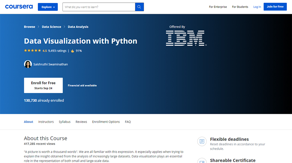
6. Data Visualization with Python – Offered by IBM [Coursera]
The primary skill of every data scientist is their ability to put forth a compelling story, visualize the data, and present the data in a manner that allows you to extract information, comprehend the data, and make informed decisions.
In this one of the top data visualization online courses,you will be employing different data visualization libraries in Python, namely Matplotlib, Seaborn, and Folium.
| Institute | IBM |
| Instructor | Saishruthi Swaminathan |
| Duration | 20 hours |
| Certificate | Yes |
| Self-paced | Yes |
| Rating | 4.5 |
| Enrolled | 130,730 |
| Return or Refund | 7-days trial, after which you will have to pay. You can receive your refund within 14 days of the payment. |
| Cons | Certain assignments are not focused on the aspects and concepts covered in the class. It may not seem very clear for the course takers. |
Learning Outcome
In this data visualization class,you will learn to:
- Comprehend data when it is presented to you for the first time and has no or little meaning
- Present the data in a manner that makes sense to people
Who should take this course?
This is the best data visualization certification course for intermediate-level learners. So, some prior knowledge is recommended for taking this course.
You can take this course towards your learning for any of the below-listed programs:
- IBM Data Science Professional Certificate
- Applied Data Science Specialization
- IBM Data Analyst Professional Certificate
Review AM:
Great course, one of the best course to get hands-on learning for Data Visualization with Python. Particularly the lap exercise, it will make you think on every line of code you write. Excellent!!!
7. Data Analysis and Visualization Foundations Specialization – Offered by IBM [Coursera]
![Data Analysis and Visualization Foundations Specialization – Offered by IBM [Coursera]](https://www.tangolearn.com/wp-content/uploads/2021/09/data-analysis-and-visualization-foundations-specialization-by-ibm.jpg)
This data visualization class is a cluster of three courses. It is meant for the learners who intend to start a career in Data Science or become Business Analysts.
Further, professionals requiring basic visualization and data analysis skills will also find this course helpful.
| Institute | IBM |
| Instructor | Rav Ahuja, Steve Ryan, Sandip Saha Joy, and Kevin McFaul |
| Duration | 4 months (2 hours per week) |
| Certificate | Yes |
| Self-paced | Yes |
| Rating | 4.8 |
| Enrolled | 8,360 |
| Return or Refund | 7-days trial, after which you will have to pay. You can receive your refund within 14 days of the payment. |
| Cons | When you take the quiz, the result that you receive as feedback is correct or incorrect. This seems like an incomplete manner of feedback. The system must tell the learner why the answer is wrong and the right answer. |
Learning Outcome
Some of the things that you will learn with this data visualization certificate program are:
- Describing the data ecosystem
- Understanding the tasks and responsibilities of a Data analyst
- Using Excel to perform a variety of data analysis tasks like data wrangling and data mining
- Skills and tools needed for successful data analysis
- Listing different kinds of charts and plots
- Creating the plots and charts in Excel
- Working with Cognos Analytics to generate interactive dashboards
- Explaining the basic functionality of spreadsheets
Prerequisites
This is a beginner-level data visualization training course. But, you are required to possess basic computer literacy. You must be comfortable with numbers, be thorough with high school math, and must have the willingness to take a self-paced course online.
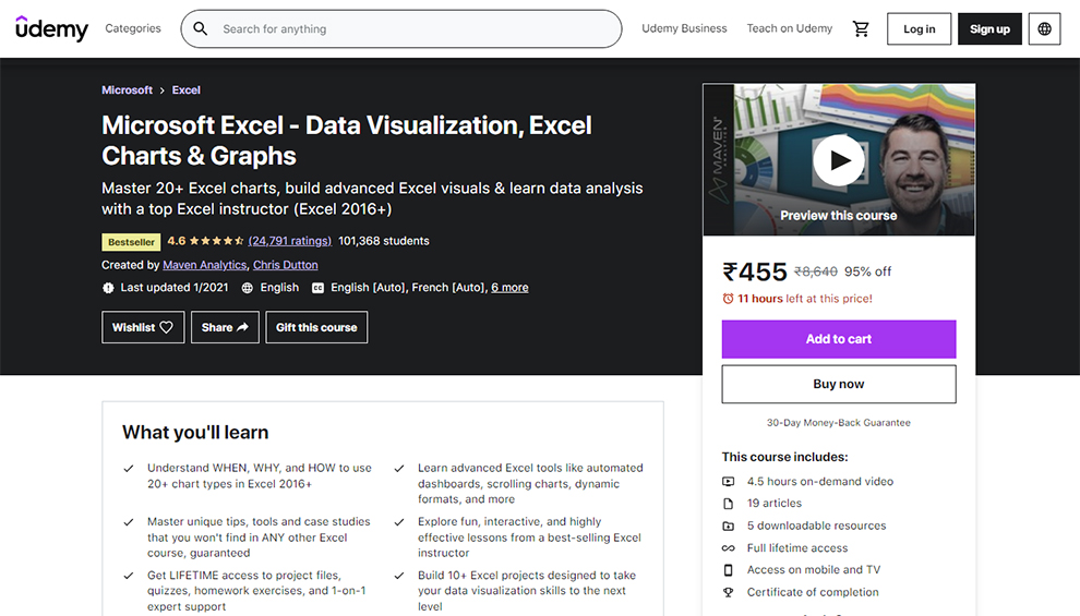
8. Microsoft Excel – Data Visualization, Excel Charts & Graphs – [Udemy]
This is a bestselling data visualization certificate program. In this data visualization class, you will be working on over ten Excel projects to take data visualization to a whole new level.
You get lifetime access to the quizzes, project files, homework exercises, and one-to-one expert support with this class. Overall, with this course, you get a complete comprehensive understanding of Excel’s latest techniques and tools.
| Level | Advanced |
| Instructor | Maven Analytics and Chris Dutton |
| Duration | 4.5 hours on-demand video |
| Certificate | Yes |
| Self-paced | Yes |
| Rating | 4.6 |
| Enrolled | One of the data visualization online courses with the highest enrollments of 100,951 students |
| Return or Refund | You have two options:
|
| Cons | In some parts, the expressions and tones are not clear. |
Learning Outcome
It is one of the best data visualization courses online and has an array of things for you to learn. Some of them are listed below:
- The class teaches you the why, when, and how to use over twenty chart types in Excel. This includes:
- Bar & Column charts
- Histograms & Pareto charts (Office 365, Excel 2016 or Excel 2019)
- Line charts & trend lines
- Area charts
- Pies & Donuts
- Scatter plots & Bubble charts
- Box & Whisker charts (Office 365, Excel 2016 or Excel 2019)
- TreeMaps & Sunbursts (Office 365, Excel 2016 or Excel 2019)
- Waterfall & Funnel charts (Office 365, Excel 2016 or Excel 2019)
- Radar & Stock charts
- Heat maps, 3-D Surface & contour charts
- Chloropleths & Geospatial maps
- Custom combo charts & graphs
- Sparklines
- And more
- Advanced tools of Excel, such as dynamic formats, scrolling charts, automated dashboards, and others.
- Familiarizing yourself with unique tools, tips, and case studies that are absent in other Excel courses.
- Learn the interactive, fun, and effective lessons associated with Excel.
Prerequisites
Some things needed to take this data visualization class are:
- Microsoft Excel, ideally 2016+, or
- Office 365 for PC
Is it the best data visualization certification course for you?
This data visualization certificate course is for:
- Anyone aspiring to start a career in business intelligence or data analysis
- Anyone wishing to build compelling and beautiful data visualizations in Excel
- Excel users who possess basic skills but wish to master graphs, advanced charts, and dashboards
- Students who seek a hands-on, engaging, and interactive approach to training
- People who want to pursue a career in business intelligence or data analysis
Review Maria Inmaculada de la Torre Ruiz:
Great course to get you started working with Charts from a beginner point of view and take you to more advanced techniques that will get started producing Dashboards. Easy to follow and plenty of exercises to practice at all levels.
9. Mastering data visualization in D3.js – [Udemy]
This is a bestseller data visualization training course from Udemy. In this course, your instructor attempts to take you from the start point and help you build your knowledge on D3 to build all kinds of visualizations.
| Level | Intermediate |
| Instructor | Adam Janes |
| Duration | 15 hours |
| Certificate | Yes, this is a data visualization certificate program. |
| Self-paced | Yes |
| Rating | 4.5 |
| Enrolled | 18,290 |
| Return or Refund | You have two options:
|
| Cons | It seems like an absolute theoretical data visualization course with very few exercises. |
Learning Outcome
In this data visualization certificate course, there is an array of things you will learn. These include:
- Knowledge of the fundamental D3 building blocks
- Acquiring diverse knowledge and creating 14 different visualizations. Some of them are:
- Line Charts
- Area Charts
- Stacked Area Charts
- Pie Charts
- Donut Charts
- Wordclouds
- Choropleth Maps
- Node-Link Diagrams
- Tree Diagrams
- Treemaps
- Circle Packs
- Sunburst Plots
- Articulating original abstract ideas with compelling sketches
- Mastering advanced D3 tools, building layouts, brushes, choropleth maps, and tooltips
- Inventing better designs to display data
- Developing substantial web apps with multiple visualizations on the page
- Interpreting open source code from the D3 community for utilizing them in their projects
Prerequisites
To take this data visualization certificate course, you must:
- Have a decent understanding of HTML, CSS, and JavaScript
- Know how to interact with the Document Object Model (DOM) using jQuery
Who should take these data visualization online courses?
It is not your introductory web development course. Students require some coding experience in jQuery, HTML, JavaScript, and CSS to take this course. This data visualization certificate course is meant for:
- Students with a passion for working with data
- People who aspire to learn about the data visualization design
- Learners who wish to build complex interactive websites with D3js
Review Richard Walker:
Covering a host of very important features. True expert knowledge of subject. Tutorial-like approach. Conveying strengths of the framework for increased appreciation of value. Includes section on design process (sketching, trying different models). Good pace of steady progression of features from one lesson to the next. Steadily building on top of previous lessons.
10. Professional Certificate in Fundamentals of Data Visualization with Power BI – Offered by Davidson [edX]
Data is a vital aspect of every field. However, not everyone has had suitable access to the data, helpful to employ it in a manner that proves beneficial for their work. This data visualization class teaches you just that with the help of the compilation of two data visualization training courses.
| Institute | Davidson College |
| Instructor | Pete Benbow and Che Smith |
| Duration | 2 months (8 to 15 hours every week) |
| Certificate | Yes |
| Self-paced | Yes |
| Return or Refund | 7-days trial, after which you will have to pay. You can receive your refund within 14 days of the payment. |
| Cons | Might feel expensive for some |
Learning Outcome
Some things included in this data visualization certificate course are:
- Analyzing, communicating, and managing the data in R.
- Understanding data lifecycle
- Becoming a critical producer and consumer of data visualizations
- Learning to market your data skills to employers
- Identifying and working with business-oriented data sets
- Building and sharing fully functional Power BI reports
11. Data Visualization – [Udacity]
![Data Visualization – [Udacity]](https://www.tangolearn.com/wp-content/uploads/2021/09/data-visualisation-Udacity.jpg)
Technical courses and Udacity are a great combination together, and this data visualization training program is an exemplary instance of it. This data visualization class is actually a nano-degree program.
| Instructor | Multiple |
| Duration | 4 months (10 hours every week) |
| Certificate | Yes |
| Self-paced | Yes |
| Return or Refund | You can buy monthly or 4-month access and cancel anytime, but there is no refund. |
| Cons | High cost for the nanodegree program. |
Who should take this course?
This data visualization training program will prove useful for data analysts who aspire to communicate more effectively. Further, business leaders who wish to develop data literacy will also find this data visualization course helpful.
Learning Outcome
A few things that you will learn with this data visualization training program are:
- Combing narratives, data, and the other visuals to make data-driven decisions
- Narrate impactful stories
- Creating dashboards and data visualizations
- Drafting presentations
- Creating animations and visualizations for offering data-driven recommendations.
Syllabus
The core syllabus for this data visualization training program is:
- Intro to data visualization
- Dashboard designs
- Data storytelling
- Advanced data storytelling
Prerequisites
There are some prerequisites to take this data visualization training program. A few things you must know in advance are:
- Descriptive statistics, such as median, mode, standard deviations, variance, and distributions
- Knowledge of analyzing the data in spreadsheets
12. Learn Data Visualization with Python – [CodeCademy]
The next data visualization certificate course is presented to you by Codecademy. It is a pro course. Upon enrolling in this data visualization class, you will be a part of the vast 45,000,000+ family of CodeCademy. In this data visualization course, you will create data visualizations with Matplotlib and Seaborn.
| Instructor | Multiple |
| Duration | 6 hours |
| Certificate | Yes |
| Self-paced | Yes |
| Return or Refund | You can cancel your subscription anytime |
| Cons | Though there is a free version available, you do not gain much unless you spend the buck. |
Learning Outcome
This data visualization course will help you present data graphically. With this data visualization training, you can see the insights and patterns in the data. Further, the instructor will attempt to make it easier for you to identify new trends and grasp complex concepts.
One of the key graphing tools in Python is Matplotlib. So, this data visualization course will equip you to:
- Create pie graphs
- Create bar charts
- Add error bars to graphs
- Create line graphs
- Add labels and styling to graphs
On top of it, you will be familiarized with Seaborn, which helps you style the graph more professionally and build sleeker graphics. This data visualization course will also help you make color scheme choices for the graph and take them to the top.
Prerequisites
To take thisdata visualization certificate course, you must be familiar with Python concepts, such as:
- Calling methods on objects
- Using lists and loops
- Writing functions
13. Big Data: Data Visualisation – [FutureLearn]
Data visualization is a key tool. It bridges the gap between data and well-informed, strategic decisions. With this data visualization course,you will learn about the various processes, tools, and methods involved in this step.
It is a rare data visualization training program because it will take you back in history (17000 BC) to understand the use-cause of data visualization in the past.
| Institute | Queensland University of Technology |
| Instructor | Tomasz Bednarz and Steven Psaltis |
| Duration | 3 weeks (2 hours per week) |
| Self-paced | Yes, it is a flexible data visualization class |
What’s covered?
The data visualization course syllabus covered by Future Learn includes:
- Introduction to visualisation
- Information visualisation
- Scientific visualisation
- Visualization tools
- Design approaches for visualization
- Visualisation for communication
Learning Outcome
Some things that you will learn with this data visualization course are:
- Exploring big data frameworks
- Developing awareness on how to participate effectively in a team that works with massive data
- Working with data experts
- Demonstrating an integrated approach to giant-sized data
Who should take this course?
This data visualization course is designed for people from different fields who aspire to know the right way to create visualizations, which simplify the challenging real-world big data problems. Though it is recommended to be familiar with computer programming, it is not mandatory.
Software tools needed
For this data visualization class,you will require an array of tools. These include:
- Tableau
- MATLAB Online
- D3.js
14. How to Process, Analyze and Visualize Data – [MIT Open Courseware]
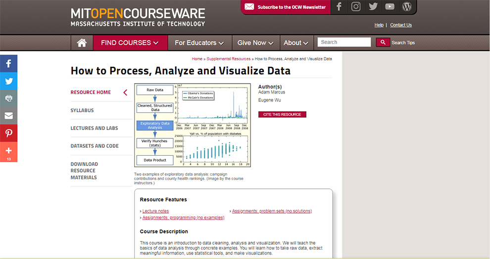
The next data visualization training program on our list is presented to you by MIT Open Courseware. It is a free resource from MIT Open Courseware. This is an introductory course and will build your knowledge from the basics using relevant examples.
| Institute | Massachusetts Institute of Technology |
| Instructor | Adam Marcus and Eugene Wu |
| Duration | 7 days |
| Certificate | No |
| Self-paced | Yes |
| Cons | It is a non-credit course. |
Learning Outcome
Some things that you will learn with this data visualization course are:
- Understand datasets
- Plot campaign contributions
- T-tests, linear regression, and statistical significance
- Text processing
- Using Hadoop/MapReduce on large datasets
Prerequisites
You must have a working knowledge to take this data visualization course. Further, you must be willing to code to find success in this course. The instructor will want you to install multiple development-related Python modules. In addition, you will have to download the datasets used during the lecture.
15. Data Visualization – [Pluralsight]
Now, we have arrived at the end of our top data visualization classes. Since, Pluralsight has multiple courses on this subject, we are torn for choice. A course that may suit one may not be good for another.
So, we have provided a hyperlink above to their subject page; where you can check the courses out and select one that best fits your need.
Some of them are listed below:
- Beginning Data Visualization with R
- Data Visualization: Best Practices
- js Data Visualization Fundamentals
Conclusion
So, these are the 15 best data visualization training programs on the internet. To know more about these courses, you can click on the link annexed and read additional information, such as enrolment data, instructor bio, course fee, and the reviews on the course. Hopefully, it will help you pick the best data visualization course for your needs.